Reimagining Tesco’s Banking Experience:
A UX Redesign for Simplicity & Trust

TIMEFRAME
4 weeks
MY ROLE
UX + UI Design, Visual Design, User Flow, Research, Prototyping + Testing
TOOLS
Figma, FigJam
OBJECTIVE TOOL
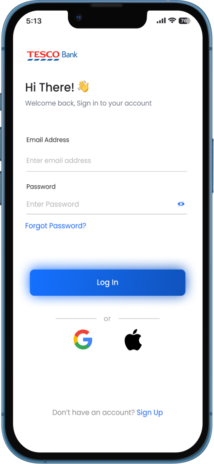
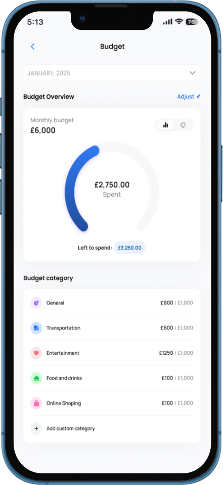
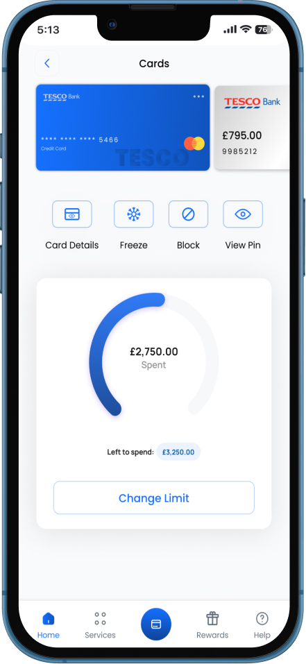
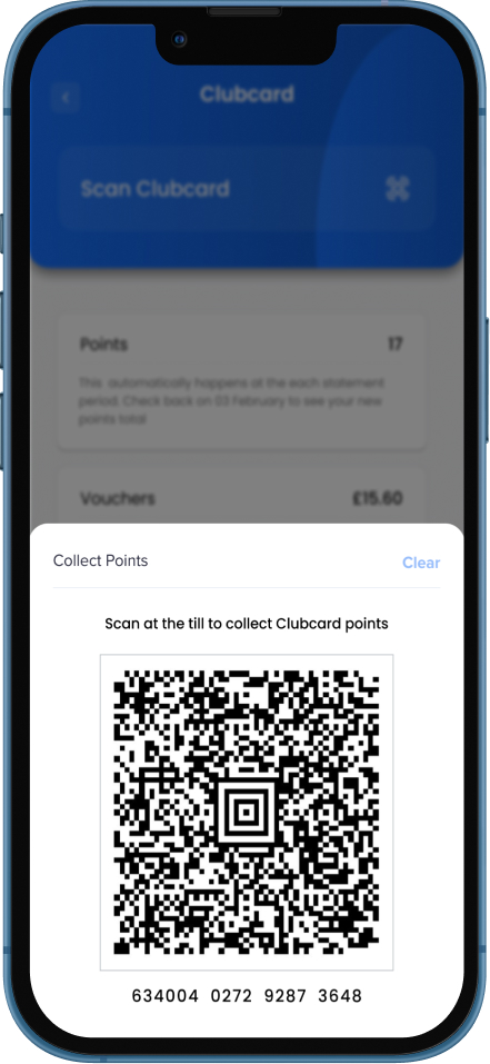
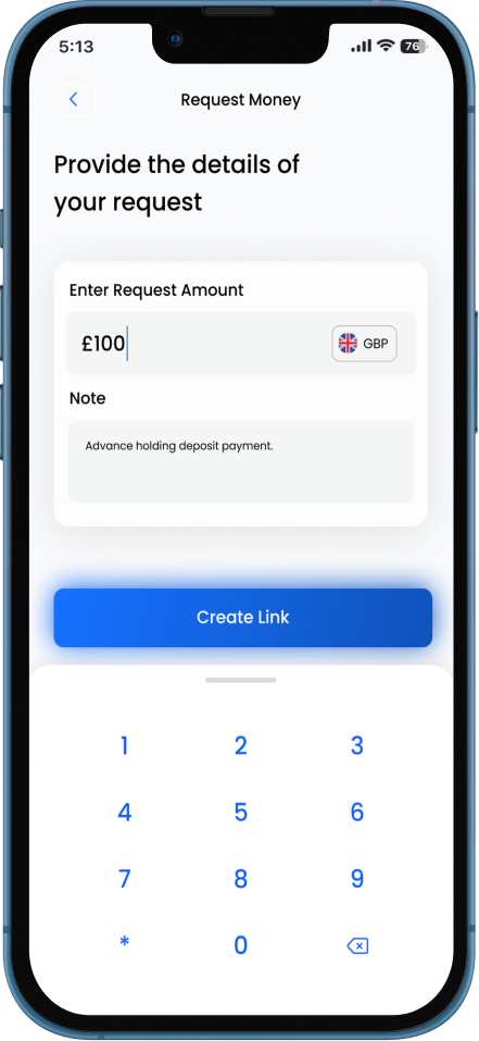
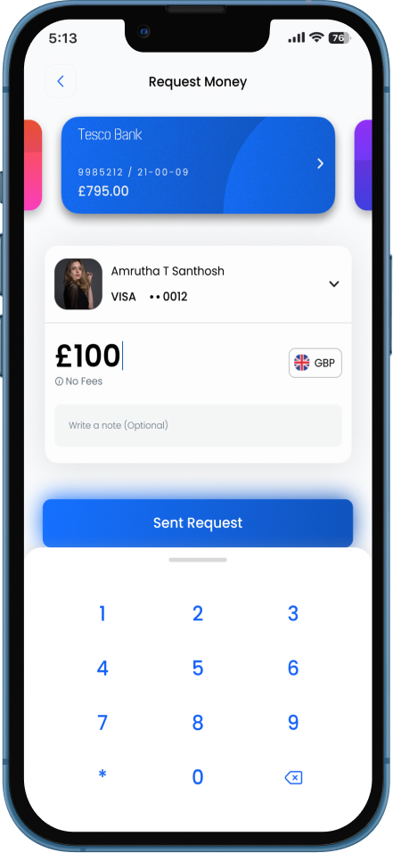
Redesigning the Tesco Bank app was an opportunity to introduce modern financial tools while addressing usability challenges. One of the main hurdles was prioritizing essential improvements without redesigning the entire app, focusing only on key flows that needed enhancement. I aimed to bring new features into the app, such as insights into spending habits, budgeting tools, Clubcard integration for earning rewards, and a "Request Money" feature for seamless transactions. Finding the right balance between introducing new functionalities and maintaining a clutter-free experience was challenging. Additionally, ensuring intuitive navigation across these additions, while keeping the existing structure recognizable to users, required thoughtful user research and iterative testing. My approach focused on revitalizing outdated flows, improving accessibility, and aligning the app with market trends, ensuring Tesco Bank remains competitive in the evolving fintech space.


My Design Process


Research
To craft an intuitive and seamless Tesco Bank app experience, I conducted user research to uncover pain points, behavioral patterns, and feature expectations. The insights gathered guided my UX decisions, ensuring the redesign addressed real user needs while aligning with modern banking standards.
Primary Research Goals
- Identify usability pain points in the current Tesco Bank app that hinder user experience.
- Understand user behavior and financial habits to inform the new feature set.
- Analyze market-leading banking apps to benchmark best practices and usability trends.
- Enhance navigation and information hierarchy for an intuitive user flow.
USER RESEARCH METHODS
To gain qualitative and quantitative insights, I utilized a mixed-method approach
- User Interviews – Conducted structured interviews with diverse Tesco Bank users.
- Surveys & Customer Reviews – Analyzed common frustrations from App Store/Google Play reviews.
- Usability Testing on the Existing App – Identified friction points in the user journey.
- Competitive Analysis – Benchmarked Tesco Bank against leading fintech apps.
Key Insights & Solutions
Key Insights
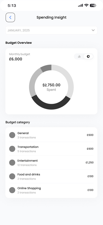
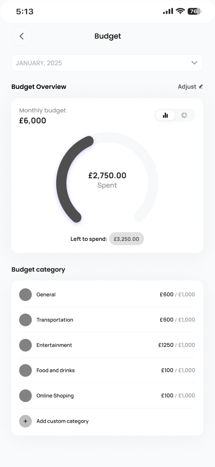
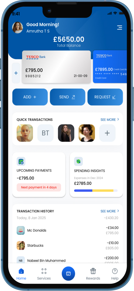
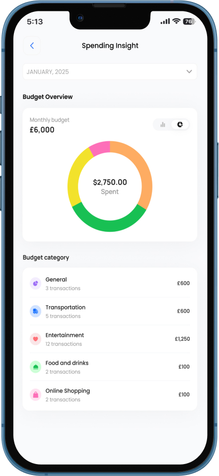
- Users want budgeting & spending insights
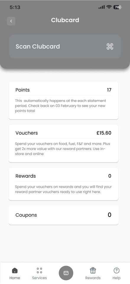
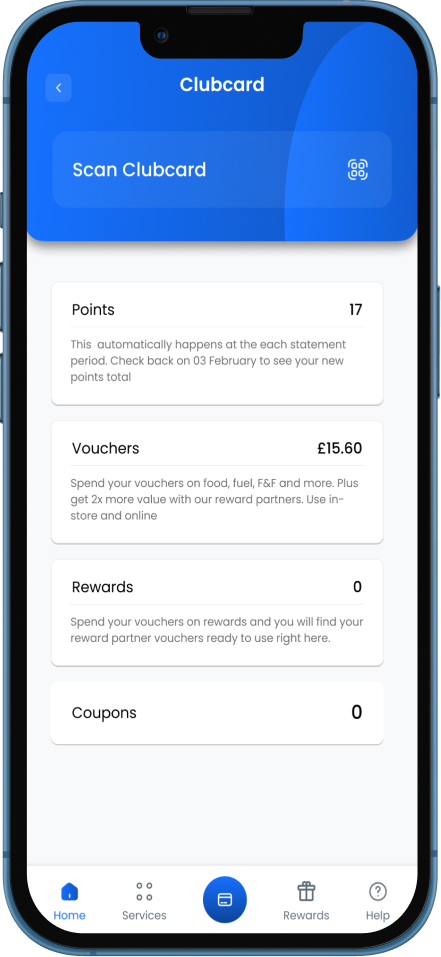
- Users struggle with Clubcard tracking
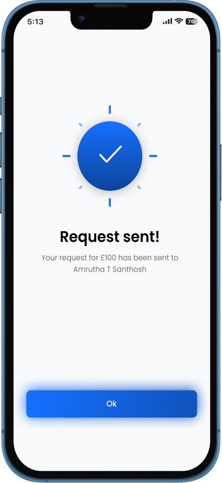
- Users want seamless P2P transactions
- Small business owners need better financial organization
- Older users need accessibility improvements
User Challenges
- No way to track spending inside the app
- Points are hidden in a separate app
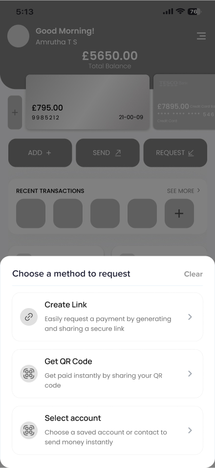
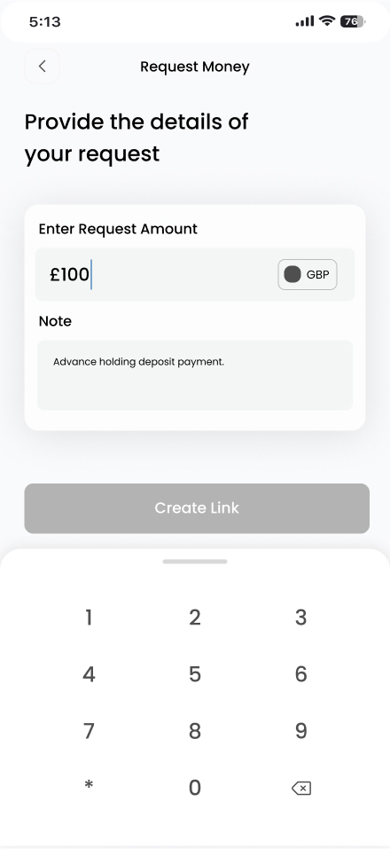
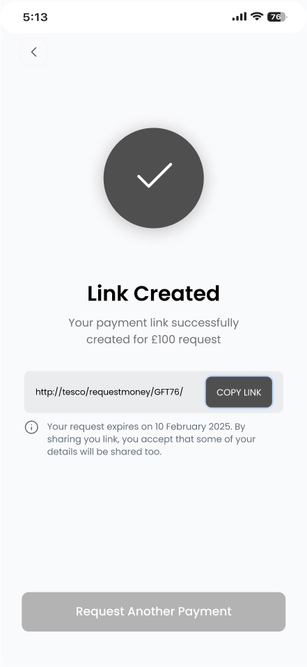
- No quick way to send/request money
- Business & personal expenses are mixed
- Small fonts & complex UI make banking difficult
Design Solutions
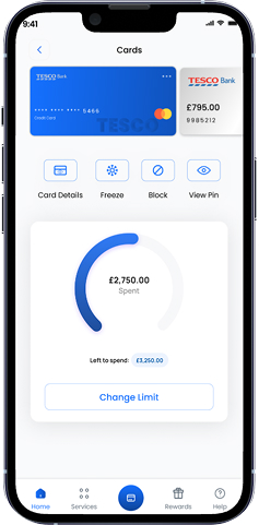
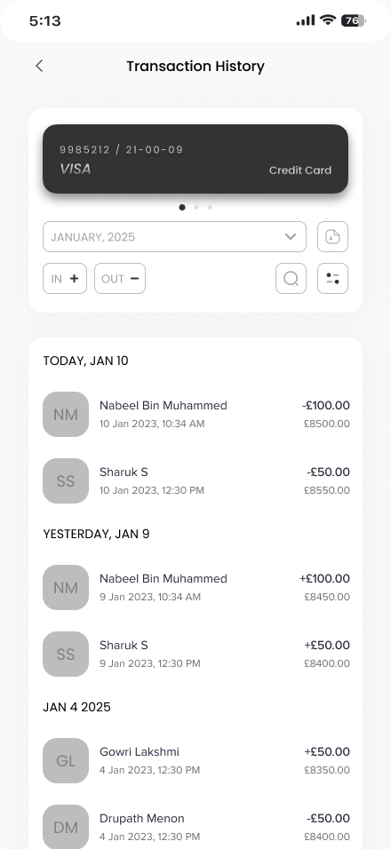
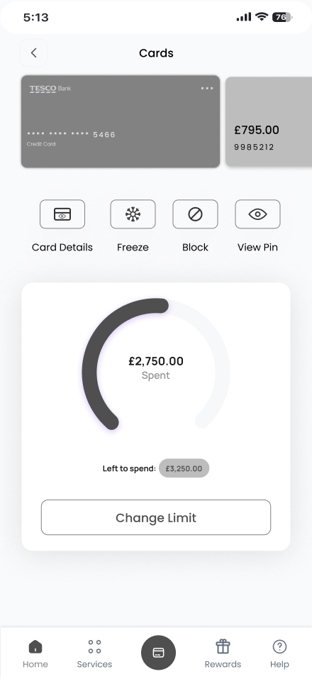
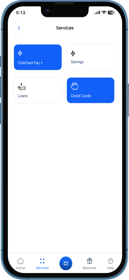
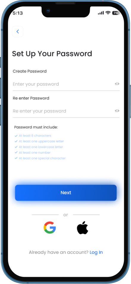
- Added Spending Insights & Budgeting Features
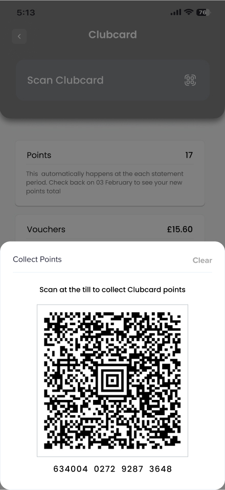
- Integrated Clubcard points & rewards into the banking app
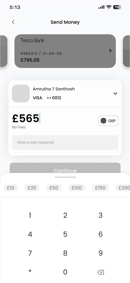
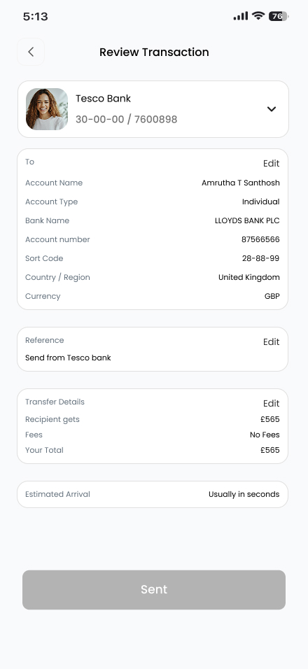
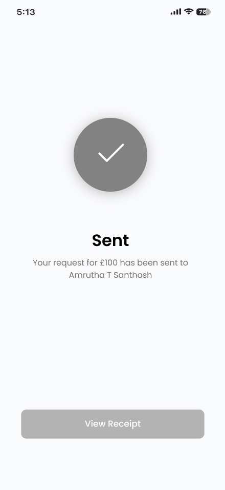
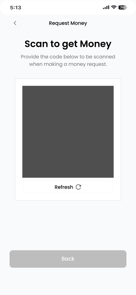
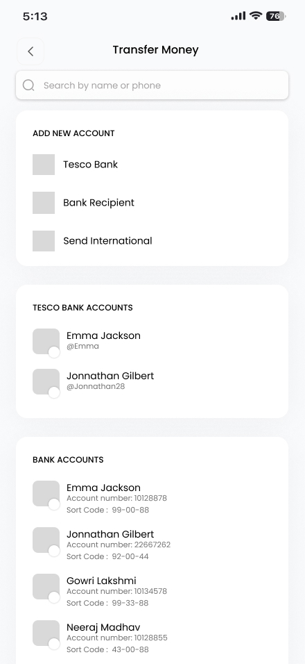
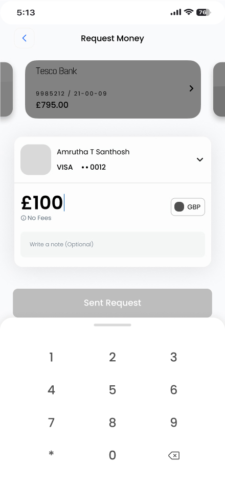
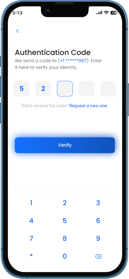
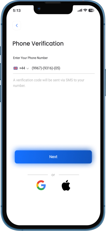
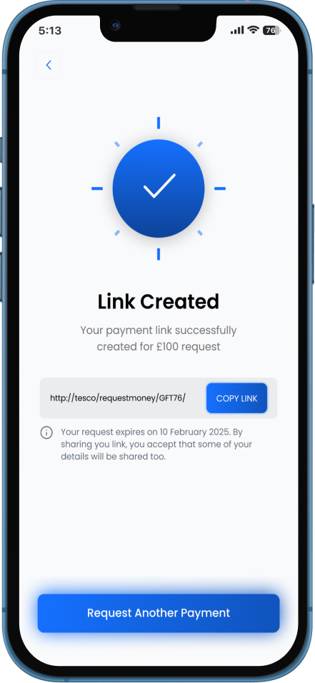
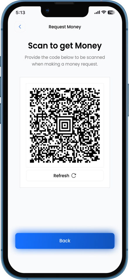
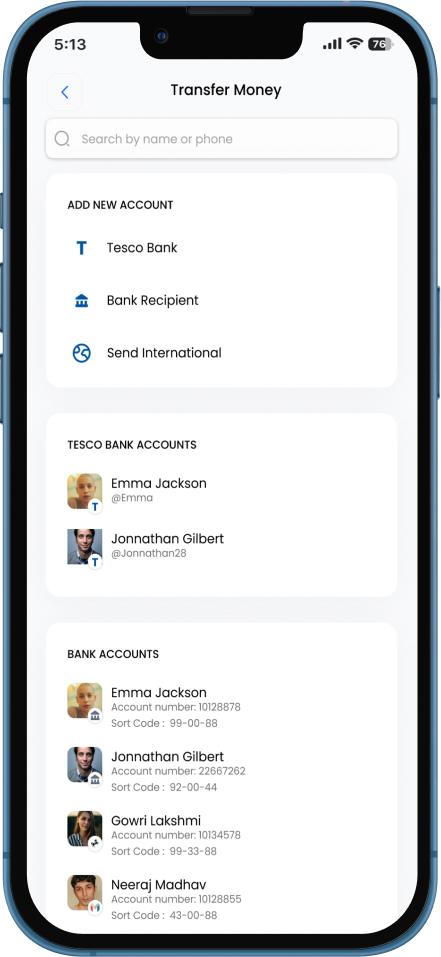
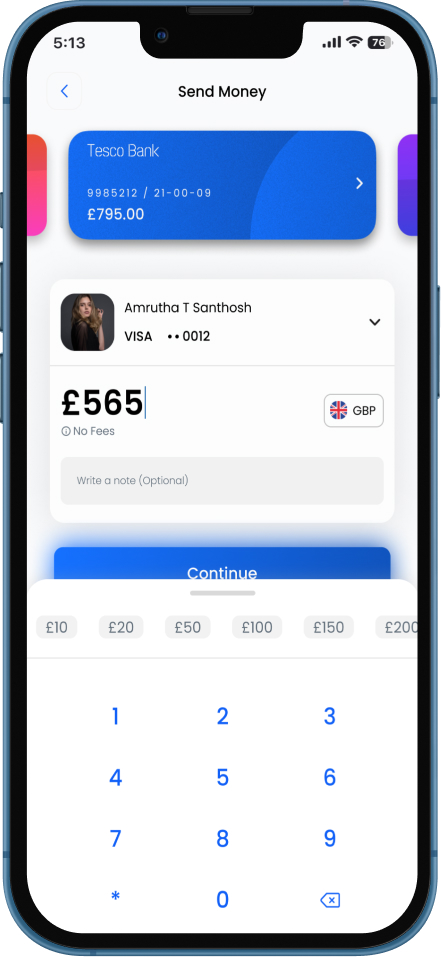
- Added “Request Money” & QR code transfers
- Created Business vs. Personal Toggle & Smart Categorization
- Introduced Simple Mode, larger text, and voice navigation
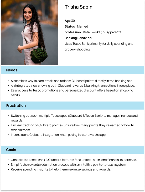
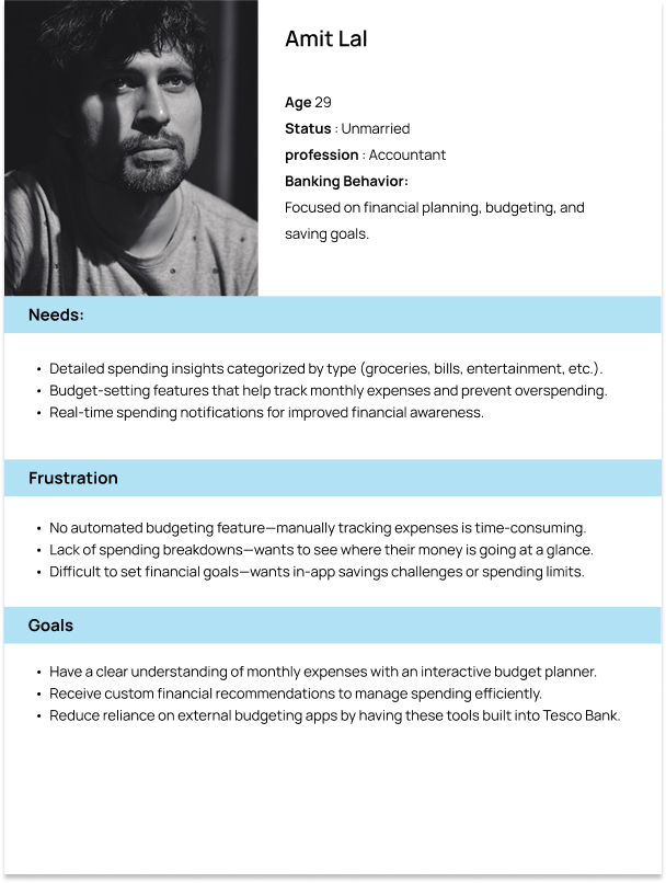
USER PERSONA DEVELOPMENT
Point of View
- Financially conscious individuals need a way to track their spending habits, because without clear insights, they often find themselves overspending or struggling to budget effectively.
- Busy professionals need a way to manage their banking and rewards in one place, because switching between multiple apps disrupts their workflow and creates unnecessary friction.
- Users who rely on digital transactions need a simple way to send and receive money, because existing processes can feel slow, inconvenient, or unintuitive.
- Older users need a more accessible banking experience, because complex navigation and small text make it difficult for them to perform essential tasks confidently.
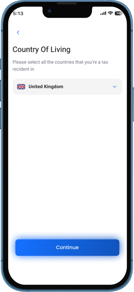
User Flow

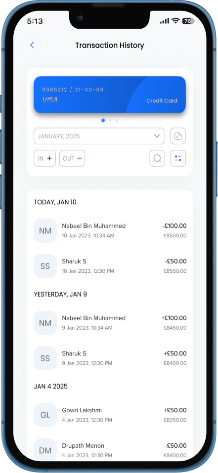
Mid Fidelity Wireframes
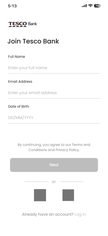
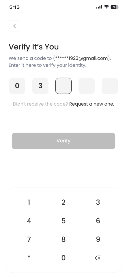
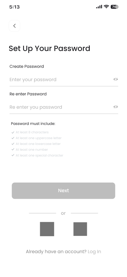
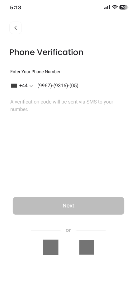
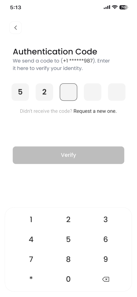
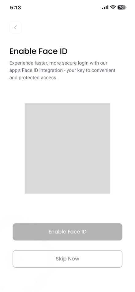
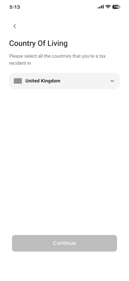
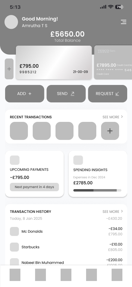
High Fidelity Wireframes
Usability Testing and Design Validation
This conceptual redesign of Tesco Bank’s mobile app was tested using various usability evaluation methods to assess navigation, readability, accessibility, and interaction efficiency. Since this project focuses on key feature enhancements rather than a complete app flow, the usability testing aimed to validate intuitive interactions, ease of use, and overall design effectiveness.
I conducted remote usability testing with five participants to evaluate how well they could complete essential banking tasks. Additionally, I performed self-led design validation using industry-standard tools and methodologies to ensure readability, accessibility, and UI clarity.
Participants
5 Tesco Bank users with different banking behaviors.
Method
Remote usability testing via Figma prototype link.
Scope
Since the full app flow is not completed, the testing focused on key feature-specific interactions rather than a fully functional journey.
Objective
Evaluate how users interact with the redesigned UI, identify usability challenges, and refine key design decisions.
Usability Evaluation Summary
PARTICIPANTS
5 Tesco Bank users with different banking behaviors.
Method
Remote usability testing via Figma prototype link.
Scope
Since the full app flow is not completed, the testing focused on key feature-specific interactions rather than a fully functional journey.
Objective
Evaluate how users interact with the redesigned UI, identify usability challenges, and refine key design decisions.
User Feedback
During the usability testing, participants shared valuable feedback based on their interactions with the redesigned Tesco Bank app. Since some features were not fully completed, particularly the budgeting setup, users provided insights on what worked well and what could be improved in future iterations.